“A Fountain Pen of German Design”
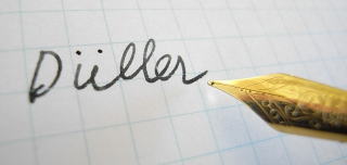
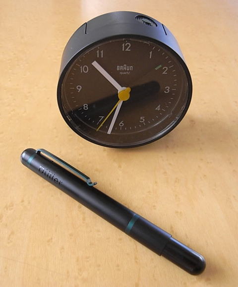
The Duller Fountain Pen designed by Dietrich Lubs 5,250JPyen
For the first time in a long time I have been bowled over by design.
The first impression was absolutely striking but once I found out who the designer was I could not let it be.
“Duller” is a stationery brand developed by “I.D.E.A International”.
The concept comes from Germany’s Bauhaus style.
So far, ball pens and mechanical pencils, notebooks, calligraphy pens and so on have been released.
Anything extraneous is shaved away and design that pursues the beauty of utility penetrates every product.
Moreover, this “Duller”, with the release so far of models in collaboration with Staedtler and so on, is actively working together with its native country, Germany.
And, this fountain pen too is a realisation of collaboration with Germany.
It is a collaboration with Germany’s representative designer, Mr Dietrich Lubs.
Even people who are not familiar with his name must have seen products he has designed.
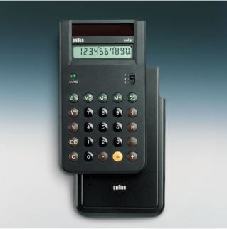
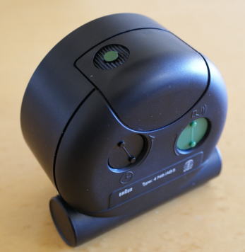
Having joined Braun in 1962, Mr Lubs has worked on many product designs.
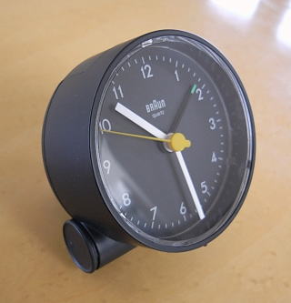
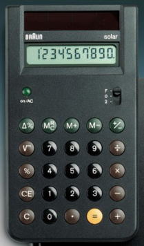
Representative of his work are the electronic calculator and the still produced AB1 and so on, clock series.
While on the subject, it is extremely regrettable that the electronic calculator is presently discontinued.
Having reached the age of 71, Mr Lubs has already retired from Braun.
Now he is not actually designing but presently acts as an advisor at Braun.
Up until now Mr Lubs has not done work for any company other than Braun and this Duller pen series is the first time.
It is said that in the media overseas it has been hailed as a “Lubs revival”.
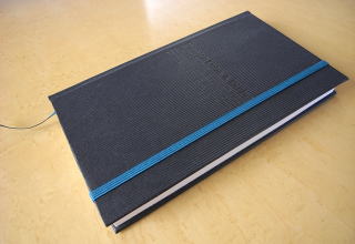
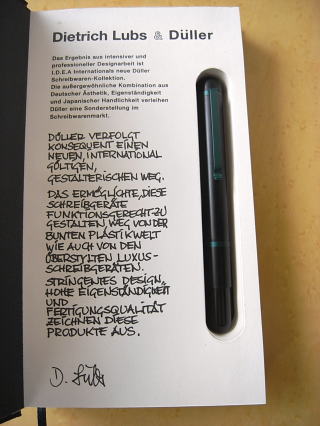
Firstly, before entering into a discussion of the pen, it is necessary to describe the packaging.
To this extent particular care has been put into the package.
The package, as you can see, is in the style of a notebook.
With its hard cover, obviously it has been constructed sturdily.
Then, without falling short of expectations, when the cover is opened the contents are exactly like a notebook.
On the first page there is a message composed in German from Mr Lubs, the designer of this pen.
To summarise the contents:
“Duller consistently conforms to the new design techniques that can be accepted throughout the world.
By this, it is distanced from the world of colourful plastics and overly luxurious writing instuments and it becomes possible to functionally design Duller’s writing instruments.
Design with taste and originality along with advanced manufacturing quality is characteristic.”,
is what is written.
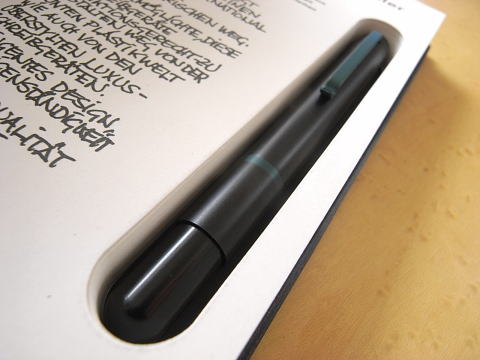
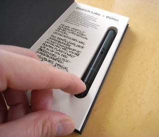
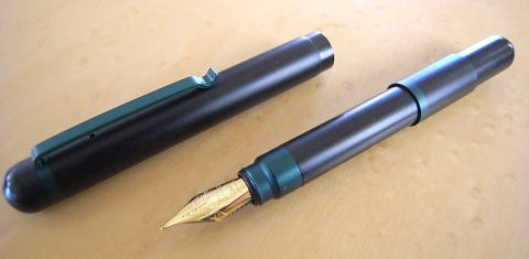
Then, as everyone has probably already noticed, the pen is embedded within the notebook.
The fountain pen fits exactly, just as if the notebook had been specially ordered for this fountain pen.
This is no alteration either, this is an exact fit that can best be called tailor made.
It is so exactly installed that I feverishly wondered how this pen should be taken out.
There isn’t any gap so even trying to put a finger in is impossible.
There is nothing to it.
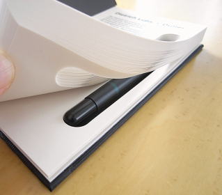
Without digging it out from above, only the pages need be turned.
On every page there is a precise cut-out for this pen.
If the pages are picked up all at once and the pile turned, the desired pen can come to hand.
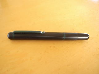
So now, at last let’s take a look at this fountain pen that Mr Lubs designed.
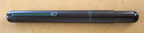
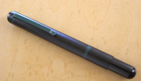
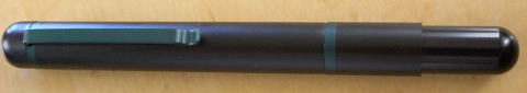
There is a so called “bullet pencil”, in the style of a bullet, and this fountain pen has just about the same shortness.
I spontaneously said“bullet pencil” but the reason I thought of this was not just due to this shortness.
This was also due to the slight narrowness down the back of the pen.
If the specifications of the pen could be seen they would probably say it is a “compact” pen.
However, on first impression rather than the description “compact” it is the word “presence” that fits nicely.
It is a design that places importance on details.
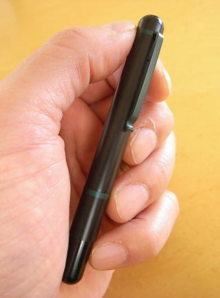
The material used for the body is aluminium.
When you pick it up, instead of an aluminium-like rough feel, the feel of the material is smooth to the finger tips.
This is probably due to the surface having a matte coating in black.
Being aluminium it is, of course, light.
There is the sense that as a practical implement for daily use it could be used casually and familiarly.
Against the entirely matte black surface, a chic green is used for every important point.
According to a member of the personnel at I.D.E.A, this green is based on the colour of some of the buttons on the electric calculator that Mr Lubs designed at the time when he was at Braun and the green colour of the alarm button on top of the clocks (AB1A, AB5 and so on).
By the way, there is a ball pen and mechanical pencil in the same design series. Regarding the crisscross texture make of their grips, it is said that at first there was an order from Mr Lubs for the same crisscross style as was used on the volume control of the Braun audio, to be put on their grips.
This time, it is said that crafting on this pen unfortunately didn’t go to that extent.
In any case, they are extremely attractive details for those who like Braun products.
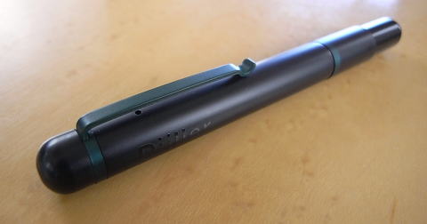
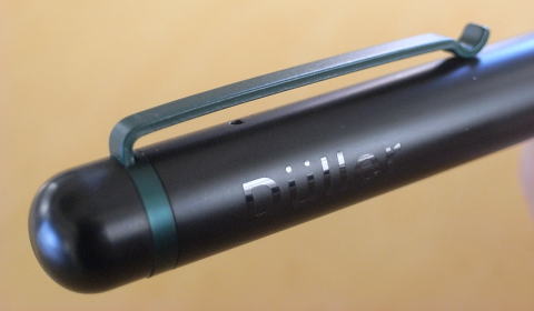
If you concentrate on the clip, which could be called the face on the body of the pen, it has a form that, while simple, is overflowing with originality.
When looked at from above, the clip stretches steadily from end to end.
With the above mentioned green used for the clip, it seems to work in perfect harmony with the green accents arranged on the body of the pen.
Next view the clip slightly from the side.
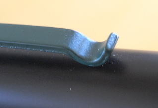
The noteworthy feature is the shape of the tip of the clip.
The tip is drawn into a curve like a spoon.
It looks both like new design and like the design of some implement that has been handed down for ages.
In any case, it seems beautiful.
The thickness of the clip is about 1.1mm which puts it, for a clip, in the somewhat thick category.
Where it differs from an ordinary clip is in the point that, without any attempt to manufacture it so that both sides are beveled, although it is narrow, it is left as a flat sheet of metal.
Due to this, as it can be seen at a glance that there is some thickness to the clip, the so-called sturdiness of the clip is clearly conveyed.
I wonder if this clip is made from the same aluminium as the body?
Somehow or another it feels like it could be made of brass.
In just one place on the matte black body there is the “Duller” logo.
Only there has a glossy process been used.
This modesty is good.
(The mutterings of the mind)
Ahh, even before opening the cap I have already written so much...
So, finally lets try removing the cap.
Momentarily I am perplexed as to where is the right place to pull off the cap.
To that extent it can be said that the body has a sense of being unified.
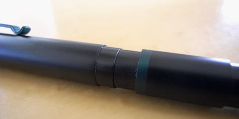
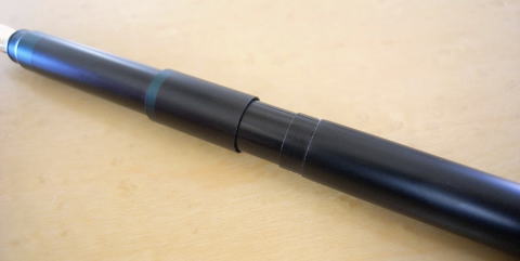
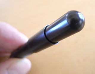
The point is the green accent marked at the rear of the pen body.
When this precisely made juncture is pulled straight, it comes apart with a small “shuu” sound.
In this state with the cap removed, writing isn’t possible at all, so the cap is to be set on the rear end of the body of the pen.
Setting this cap actually feels nice.
The end of the pen gets thinner in one part and, while it had gone completely unnoticed up until this point, where there is a change in level there is a very narrow gap.
The mouth of the cap slides precisely into this gap.
It is a finish just like the feeling of precision when the last remaining piece of a jigsaw puzzle is slotted perfectly into place.
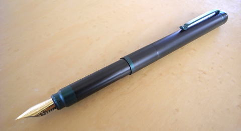
In this state, I put the pen on the desk and looked at it for a little while.
There is a good balance throughout.
From the cap to the middle of the body the line is slightly thick but at the point where the hand grips it, it becomes slenderer really naturally.
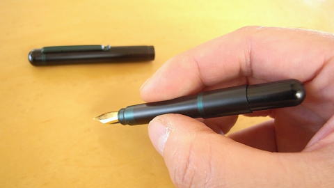
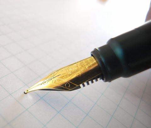
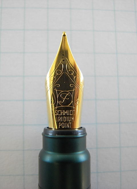
Then at the tip of the pen, saying “I am a fountain pen,” proudly attached is a gold nib.
The body, that was previously short, is completely transformed achieving a metamorphosis into a form for writing.
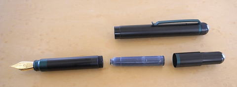
Ink is only supplied by a cartridge.
The cartridge is the small type.
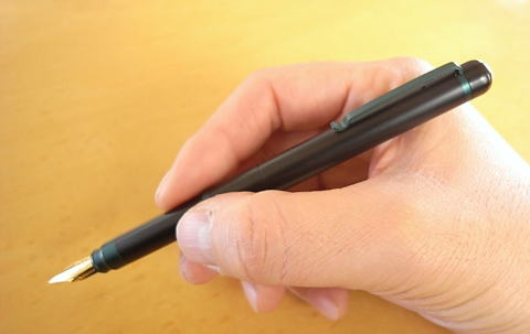
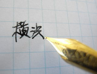
So, how is the crucial writing performance?
The body has been lengthened and taking into hand this pen that is thoroughly positioned to write, I too enter the state of being positioned to write.
The touch has a sort of hardness maybe because it is made of steel.
Even people accustomed to habitually using a ball pen perhaps would be able to write with it without objection.
It uses a nib made by Schmidt of Germany and the F size that I have gives a slightly slender impression for a European nib.
The ink flow doesn’t reach the level of being very good but is tolerable.
Rather than the nib, I think the good thing about this pen is the aluminium body that has obtained a quiet beauty and, then, its lightness.
Braun’s electronic calculator and clocks are also things for use in every day life.
In this pen, too, it can be felt that consideration has been taken not to make the user more conscious than necessary of the design.
Still, when seen by chance, there is also a feeling of “Ah, it’s beautiful..”.
That is the kind of fountain pen it is.
Postscript
As mentioned in the column above, in addition to the fountain pen there is a mechanical pencil with a cap as well as, of course, a ball pen with a cap.
![]() Top
Top ![]() Other Columns
Other Columns
![]()
Copyright (C) 2003 Tadashi Tsuchihashi,All rights reserved.